TL;DR
A workflow platform redesign that streamlined MSS’s specialty moving operations — connecting dispatchers, coordinators, and vendors through clearer job visibility, smarter workflows, and self-service tools.
- Redesigned a fragmented workflow platform for MSS’s specialty logistics operations
- Built self-service tools for vendors and dashboards tailored to dispatch and coordination roles
- Reduced manual follow-ups and improved onboarding speed for internal and external users
Results
The new app is a great way for customers and technicians to share progress and document a move.
- Automatic notifications from the dispatcher are a great experience improvement
- Fully adopted by the client’s customers, improving dispatching administrative overhead significantly
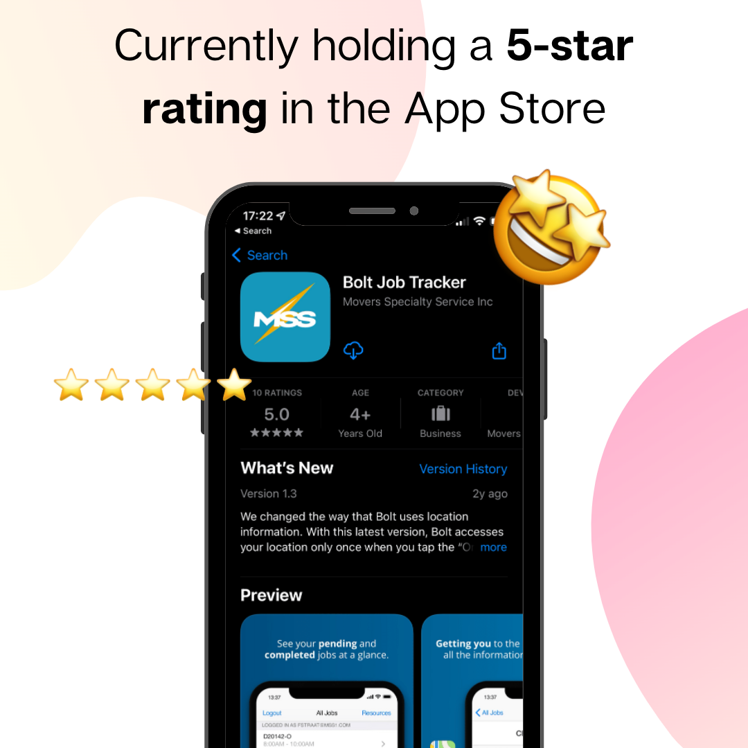
- Very positive customer feedback, a five-star AppStore rating
The app was fully adopted by the client’s partners, techs and customer satisfaction improved, and we received a 5-star rating in the app store.


Intro
Movers Specialty Service (MSS) focuses on relocating highly valuable and sensitive items, such as priceless artwork, delicate lab equipment, and historical artifacts.
MSS needed an app to improve their workflow and customer experience. More specifically, they wanted a way to prepare their technicians for jobs and to notify customers of estimated times of arrival.
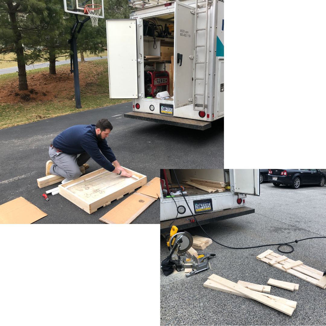
The way it works: MSS gets hired by movers and relocators to pack delicate and valuable items. MSS technicians get dispatched to the customer’s location. On-site, the technician builds a custom crate for the mover to load into the truck and transport. Upon arrival at destination, an MSS technician is dispatched in order to unpack the crate.
The Team
Many people collaborated in this project across product and development teams.
Product Team
- Design Lead
- Project Manager
Development Team
- Tech Lead
- Front-end Engineer
- Back-end Engineer
- Quality Assurance (QA) Manager
As you can see, we had a stellar team that collaborated across many disciplines, building something that I’m very proud of, and happy to share with you.

Image generated by DALL·E 1
My Role: Design Lead
- Facilitated discovery sessions and workshops
- Created sketches and wireframes
- Built prototypes and conduct usability studies
- Created and implement reusable React components
- Conducted user research

Image generated by DALL·E 2
The Context
Movers Specialty Service (MSS) was developing a Progressive Web App (PWA) to enhance the current packing and logistics tool for movers and relocators.

The Problem
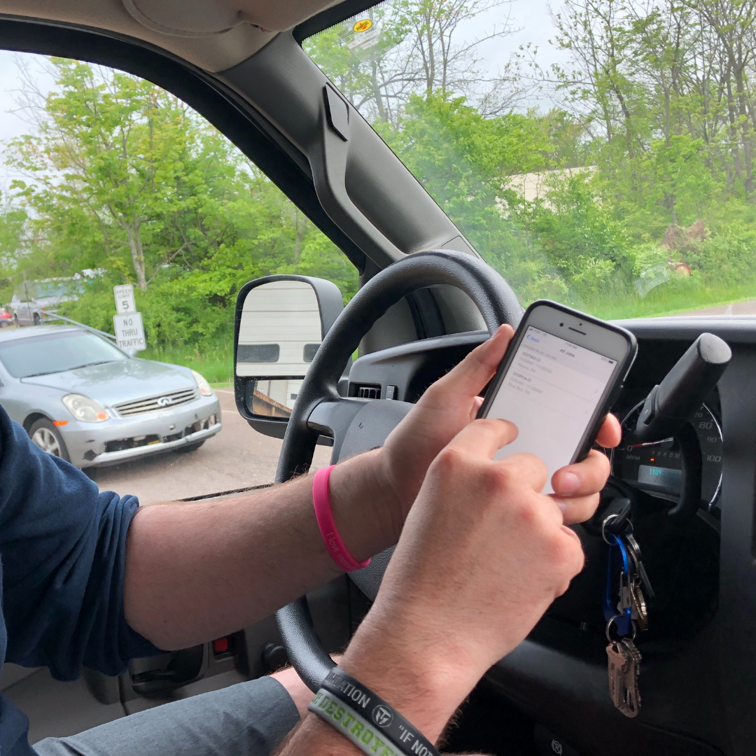
Technicians have to balance a set of apps, instructions and check lists, while doing driving, the crate building and packing work.
The current solution did not work offline, which is necessary in remote areas with limited connectivity where the technicians operate. It was hard to use because of confusing flows and cumbersome UI.
Ultimately, it was not being adopted my the client’s partners, so alternative paper-based work-flows were applied. Thus these processes were prone to error, and jobs took a significant amount of time to process.
- 📡 No Offline Access
- 👽 Cumbersome UI
- 😖 Confusing Flow
- 🤝 Poor Partner Adoption
The Objective
To research and design an end-to-end dispatching experience to help movers, drivers and technicians communicate and focus on safety and accessibility while on the move.
The objective for this project was to build a tool for the technicians and drivers to simplify their workflow, communicate better and be as focused and safe while on the move.

Process: Empathize
Let me take you through my design process.
Starting with Empathize.

First we needed to gain clarity on what frustrates our customers the most.
What are their motivations? Their frustrations?
Executives did not have an understanding of the technicians’ main struggles. We needed to make sure we were building the right set of features for this MVP.
Shared understanding of product vision & human-centric goals
- Company executives were not aware of the impact the legacy app had with dispatched technicians in the field
- Prioritize features that deliver business value
- Establish technical approach to create a realistic, achievable MVP
I went on ride-alongs with drivers and techs to get an understanding of how they work, their points of friction.
This informed my design decisions, and allowed to steer the conversations in the right direction with the stakeholders.

Went on ride-alongs with movers to learn and analyze the process.
- Shadowed and interviewed 10+ people across multiple roles (mover, dispatcher, shipper, customer, driver)
- Conducted a discovery workshop with stakeholders, product and development teams
- This informed user experience decisions, from feature ideation to app flows and screen design

Discovery Workshop Takeaways
The main takeaways from the sessions were that the team lacked the proper tools to work efficiently and effectively
The tools were needed to enable to batter care for their customers.
- Field technicians have too many confusing forms to complete
- Navigating the current app to complete job forms is cumbersome
- In-house teams do not have the appropriate tools to support field technicians in remote areas

Ride-Along Takeaways
The main takeaways from the research were around the themes of ease of use, accessibility, and network connectivity.
- Too many steps, too many screens to keep track
- Small on-screen touch areas, cumbersome to use while driving
- Unreliable Internet access in remote areas prevents system access

Process: Conceptualize
On this step, we gathered our insights and began shaping our hypothesis into potential concepts.

With a clear understanding of the workflow and experienced pain-points we needed to prioritize feature areas
- Understand key pain-points and safety concerns
- Classify all insights gathered
- Present our synthesis to stakeholders

As we started to build these flows, we were constantly validating our hypothesis and solutions with our customers.
Prioritizing, validating, and prioritizing was key to our success.
Jumped into secondary research to form our product strategy and experience.
- Created user workflows and journeys
- Prioritized customer pain-points, wants and needs
- Validated insights with customers

User Journey Map
And by mapping out these experiences into flows, we can uncover points of friction and areas of opportunity.
- Retrieving assigned job details is cumbersome
- Dead-zones prevent crucial job information flow
- Customers do not receive clear job status estimates

Current State
The current solution was not optimized for technicians on the move.
Not only was it hard to interact with the UI, the flows and procedures did not make sense.
Designed to support a paper-based system and process.

Key Takeaways
Drivers are constantly relying on a secondary device in order to get better navigation, communicate with the customer, and interact with the dispatcher.
- Drivers rely on a secondary device for navigation, traffic and photos
- Drivers manually notify the customer and dispatcher of their current status and travel estimates
- Paper forms and legacy process overhead is significant

Process: Design
Let’s design some solutions.

Estimation and user stories
A collaboration between product owners, designers and engineers
- What features should we prioritize?
- How do we estimate effort and risk?
- When and how do we involve QA?
The collaboration between design, engineering and project management was key in order to prioritize and estimate accurately.

Wireframes
Once the flows were established, quick wireframing leveraging the current design system was next.

Prototypes
Building prototypes with the design system allows us to have higher fidelity concepts out faster. We could then test those prototypes with users live. Without coding at this point.

User Testing
And by constantly validating with user studies, we can adapt and iterate quickly.
- Conduct studies to evaluate design success based on unit tasks
- Iterate and adjust user flows and layouts based on feedback
- Measure success across multiple testable paths

Iteration & Refinement
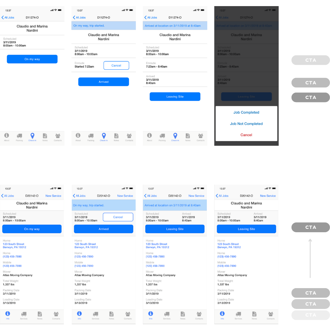
This is an example of how early testing and iteration was helpful at finding crucial improvements.
In this example the CTA is located in different part of the screen, depending on the content up top. Causing the CTA to potentially be hidden below the fold.

By relocating the CTA at the top, in a dedicated section along with the job status section, we improved discoverability and task success.
Design System
We needed a visual system that could scale with content.
And components that could be reused and re-purposed. We also wanted to make sure the UI looked native for iOS and Android.
- Implement reusable components to eliminate inconsistencies
- Build components to enable the team to build their own layouts
- Leverage native components in iOS and Android where possible

Empty States
Paying attention to Empty States was crucial to accomplish a smooth experience.
Many times these screens are overlooked and not prioritized allowing for a fractured flow.
- Ensure users can experience a smooth and uninterrupted flow
- Highlight and suggest action items to increase initial actions
- Expand on incorporating a dedicated on-boarding experience

The Solution
Our solution was focused around displaying content the right way at the right time, improving the workflow, and prioritizing safety and attention for our drivers.

How might we manage and display our content to make it available offline, organized, and contained while dispatched on the job?
- Improve workflow efficiency and accuracy
- Reduce safety risk for drivers interacting with the app in the field
- Eliminate the need of paper-based documentation thanks to offline capabilities

The progressive web app is a great way for technicians to manage relocations and moves and keeping the customer informed at all times
- Working on multiple jobs in different stages at once
- Job information and images properly organized
- Offline capabilities for areas with no Internet coverage
What’s the solution? An app that allows technicians to:
Reduce confusion, work on multiple workflow stages at once, have their information properly organized, and offline capabilities.

Next Steps
MSS’s work became easier than ever and, due to additions based on user insights, reporting happened consistently.
- Define an on-boarding experience
- Better edge-case design
- Access completed jobs

